New Thing: Numbered Bases for Gloomhaven, Part 1
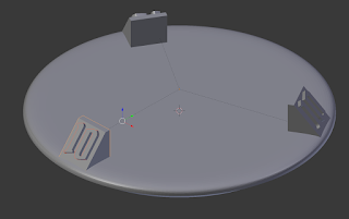 Ok, this isn't really a new thing, but I haven't written about it before, so I guess it qualifies as new for blogging purposes! I've been getting a lot of positive feedback about my 25 mm numbered bases recently, so I figured that I should write about how to make them! I don't yet have a use case for larger or smaller bases, but I'm sure that there are people out there who do... so here's a guide for how to make such a thing if it's needed!
The original version of these is a Frankenstein monster that started in Fusion 360 and eventually migrated to Blender. I've learned a lot about how to use Blender since then, so I'm going to make a new version entirely in Blender and can document the process here. If all goes according to plan, it should be pretty easy to scale up or down arbitrarily to make different base sizes, or use different numbers or amounts of number stands... well, let's get to it!
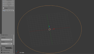 The first thing to do is to hit shift-a to add Mesh -> Circle. I set mine to have 32 vertices and a radius of 12.5 mm (I like to work at a scale where 1 Arbitrary Blender Unit (ABU) = 1 mm, but that's just preference). That circle is the outer edge of the base, so the next steps will be to add the rounded corner up to the flat top and the tapered bottom (to help the "elite base" both be more visible and to give you something to grip on when removing it). We'll start with the rounded top.
First, put a Subdivision Surface modifier on it, and crank up the Subdivisions to 3. That should make the circle extra round, but importantly it'll make our soon-to-exist upper edge nice and rounded, too.
 Go into Edit mode with everything selected (press a a few times to select everything if it's not already selected for you) and press f to make a face. Then, press e to extrude that face and type .5 to extrude it .5 mm up. At this point you've probably got an ugly wavy disk thing, but it's actually a really good start. After all, the geometry that you've made isn't ugly and wavy, so now you just need to help Blender realize it by adding in a bit more definition.
 Starting with the top of the base, select the top face and press e and then esc. This will extrude a new face but then leave it exactly in place over the existing face, which would be a problem... except for our next step. Press s and then .8 to scale the new face down to 80% of the original face's size. Do that again a couple of more times so that you have a flying-saucer thing like this.
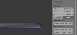 It doesn't look like it, but the top's totally done now. So, select the bottom face of the circle and go to the Transformation section of the Data Panel on the right side of the view port. If it's not there, press n to bring it up. Find the Mean Crease setting and crank that up all the way to 1.0. That'll instruct Blender to not round out that edge at all, giving you that nice, curved edge.
 Now, it's time to work on the bottom taper. This part's easy - select that bottom face again, then press e and 1.5 to extrude it downwards 1.5 mm (giving us a 2 mm thick base, change these numbers around as you wish!). With the new bottom extruded (and the new bottom face still selected), just scale it down to 85% by pressing s and then typing .85.
I'm literally doing this as I type up this tutorial, and I realized that I don't like the ratio of curved top to tapered bottom. I could go back and adjust the numbers in this post and redo things, but I figured that it would be more helpful if I actually describe how I'm fixing it (and it's not hard!).
 So, I decided that I wanted a little more to the top rounded part and a little bit less to the tapered bottom. To accomplish that, I changed into edge select mode by pressing ctrl-tab and selecting edge. Then, I selected the middle edge loop via alt-right click, and moved it down .2 mm by pressing g, z -.2. I liked the way that looked a lot better.
 Next, it was time to add the Numbered stands to the bases. To do that, I hit shift-a and added a mesh -> cube and then immediately pressed g to grab it, then moved it 1.5 ABU up on the Z axis by pressing z 1.5. That set the cube on top of the surface of the base. I decided that the number stands should be about 3 mm cubed (with the tilted face, so I scaled up the default 2 mm cube. I moved into edit mode, then pressed s 1.5. Of course, that put the bottom of my cube below the surface of the base, but you'll soon see that that's a feature, not a bug!
 At this point, that cube is really well centered on the base, and we're going to take advantage of that fact. While in Edit mode (it's important that this be done in Edit mode), slide it along the Y axis until it's at the edge of the base. You can either do this by hand with the Y axis handle (the green arrow) or you can press G and then Y and some number. I like the way it looks by moving it -10.815 mm along the Y axis.
By leaving the cube slightly below the surface of the base, we've ensured that the rounded edge won't create a gap beneath the number stand. By moving the geometry while in Edit mode, we've left the center of that geometry at the XY origin, which will help us later when we make duplicates. But, that comes later; first, let's improve the display angle for the number.
 That's a really simple task. Just select the top, outer edge, and slide it along the Y axis until the shape looks good. I moved it 2.5 mm when I made mine. Now that the stand for the number is in place, the next step is to put a number on it! To do that, hit ctrl-tab to go into Face Select mode and select the face that's gonna get the number. Then, hit shift-numpad 7 to change your perspective so that you're looking directly down at that face. Now, drop out to Object mode, left-click on the left bottom ish part of the face (to put your 3D cursor onto it) and press shift-a then go to text.
 Look in the bottom left corner of your screen - there are some options for controlling that text. The one you're most interested in is Align to View. You may also want to play around with the Radius to get the text at a decent size, but that can be fixed later, too. Aligning the text to your view means that it will be perfectly in plane with the numbered stand, which is nice =)
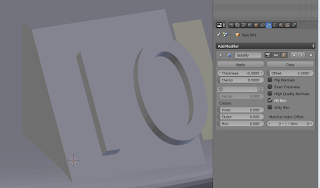 I found it helpful to give my number some thickness at this point, so I put a Solidify modifier on it, with a thickness of -0.3. That made it easier to see my text (and made sure that it would protrude enough to be printable). With that modifier in place, I then changed over to Edit mode and changed my text. Since 10 was the widest number that I expected to put on the numbered base, I decided to do my work with a 10 on there.
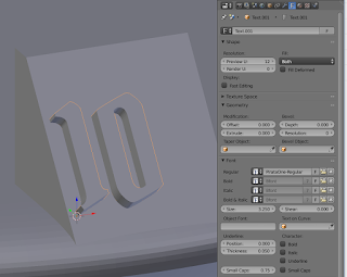 With my text in place, I decided to set the font. That's not the easiest thing to do in Blender, but it's not terrible either. On the font tab, down in the Font section, I pressed the folder icon next to Regular. Then, I browsed to C:\Windows\Fonts (go to wherever you keep your fonts) and selected the font that I wanted to use. As you can see, the spacing on the Gloomhaven Pirata font is much less than on the default (arial?) font. Also, notice that there's a Size setting in there; here's a good chance to actually set that font size to something that looks good.
 With the numbers sized correctly, the next step is to center them on the platform. With those numbers selected (in Object mode), press shift-numpad 7 to look directly "down" at them. Then, ensuring that your manipulator is set to local, use the red local x-axis arrow to slide the numbers left and right and, if needed, use the green y-axis slider to adjust them up and down (left/right/up/down are dangerously relative terms in this situation, so I'm a little hesitant to even use them...).
 Almost done with the top of the base! Now that our number is on its stand, it's time to make duplicates. First, we'll want to parent the number to the stand by selecting the number, then shift-right click the stand and press ctrl-p, then select set parent to object. Now, with them both still selected, press alt-d to make a linked duplicate, then r, z 120 to rotate that linked duplicate 120 degrees around the z axis. Make another linked duplicate in that exact same fashion, and you've got a base with 3 numbered stands on it! Want 4? Just use 90 degree rotations and make 3 linked duplicates! You get the picture =)
An advantage to using linked duplicates like this is that when you want to change the number, you just have to do it on one of them and they'll all reflect that change! They don't all reflect positioning changes though (unless you make them in edit mode), so you might have to re-center your numbers as you change them.
Well, this post has turned into a bit of a monster, and I'm not even done yet! I need to call it a night, so I'll write about how to create the bottom half and how to make it snap onto the top half later!
The .blend file for this part of the new 25 mm base is available to my patrons here!


Comments
Post a Comment