New Thing: Mine for Scythe
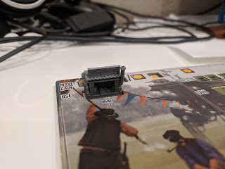
 I've been working on 3D models for all of the Scythe buildings and recently uploaded the Mine Entrance to Thingiverse. This was a challenging model for me to make, which meant that it ended up being a lot of fun.
The first issue that I had was in figuring out just how to represent a mine entrance on the 19 mm x 10 mm footprint that I had to work in (so that it would still fit in the cutout on the board). I live in Northern California, so I've seen Gold Rush Era Mine Entrances all my life. So, I figured that my task was to take that kind of "large timbers holding up a cross-piece" common image and reimagine it in terms of diesel-punk Eastern-Europe, all while fitting within that little footprint.
I started by taking the default Blender cube, and scaling it so that it would be 19 x 10 units (deciding that each unit in Blender would be 1 mm IRL), so that I could get a look at my footprint. Then, I figured that I was going to need a kind of rock surface on 3 faces of that base, to represent the hillside that the mine would be carved in to. To make that rocky wall, I added another cube (Add -> Mesh -> Cube), then extruded a bunch of sections out from it, scaling them up and down as I went until I had a rough shape for the walls (using the same method I wrote about in my Blender leaf tutorial). After I had the blocks in place, I changed into Sculpt mode, selected the Draw tool, enabled Dyntopo and started subtracting and adding material until I had a vaguely stone-like texture where my block walls once were.
 After that, I figured that I'd make the corrugated metal roof. I made that in Fusion360, although I probably didn't need to bother with that. I traced out an array of guide lines to make 3 rows of 1 mm squares. Then, I used the Spline tool to draw a sine wave through the top three layers of intersections, with another such wave through the bottom three. I joined the ends, then extruded that out a few cm, and called it good.
 With a section of corrugated metal built in Fusion360, I imported that into Blender and scaled and cloned it to make the roof that ended up on the model. This is where I first got to have some fun with perspective - the corrugations on the top of the roof are parallel, as you might expect, but I grabbed the edges on the underside of the roof and scaled them inwards. This picture to the right (assuming that I got my formatting correct, which I might not have) shows how the veins all trend inwards as they go deeper into the mine. I also made the metal thicker towards the back, to exaggerate the sense of depth.
 With the roof built, I figured that it was time to make the supports. They were just individual cubes, ring cut and then extruded to make into I-Beams. After the front ones were built, I copied them and moved them backwards, scaling them down a bunch to try and enforce the perspective trick. This side view wire-frame shows just how much smaller the ones in the back are than the ones in the front (as well as how much thicker the roof is back there). I initially planned on using wooden support struts, so I actually did my copying before I put on the I-Beam patterning. Since the backs of the rear beams would be stuck in the wall, I didn't bother putting any details on them.
 At that point, I had the basic mine in place, so it was time to add details. I figured that an exhaust pipe would be a good thematic addition and that it would give me another chance to reinforce the perspective trick. So, I added a new cylinder and built the pipe that sticks out on the right. I made sure that the part that protruded visibly out would have a proper 90 degree angle, but then after that it had to jog strangely to accommodate the forced perspective. That little jog happens between the support beam and stone wall though, so isn't visible. I also scaled down the back end of the chimney pipe, once again, to give the impression of greater depth.
It was looking too much like a house at this point, so I decided to add the rail tracks. They were another excellent opportunity to reinforce the perspective, so I made sure that the rails got smaller as they went back, that they grew nearer together, and that the spacing for the railroad ties also got closer. I just sortof moved them around by hand until I thought that they looked good. Once this was all in place, I did some more work on the rock wall to make sure that my trickery was adequately hidden and that things like the pipe wouldn't need support material when printing.
The final internal element that I added was the oil barrel on the left. I just felt like that space needed something in it, so it gave me a chance to take an object that we see a lot when playing the game and generally tie the mine's aesthetics into the game's a bit more.
After I finished that, I realized that I had a problem. There wasn't a good way to differentiate one player's mine from another. I solved that by adding a big sign on top of the mine, which could be painted in each of the factions' colors. Since I had a sign, I had another opportunity to ground my visuals in the game's visuals, so I found the Ukrainian word for "Private" (since each mine is only accessible to the faction that built it) and put it on there via a Boolean Difference modifier. I should probably write up a tutorial on Boolean operations, as they are super useful for this kind of thing.
 And, there you have it, my Scythe Mine, in all its glory!


Comments
Post a Comment