New Thing: Scythe Power Token
 I recently picked up a Scythe expansion and, due to a packaging error, received 2 Wind Mills for one of the factions... but no Power Token! Not exactly the end of the world, but certainly a good push to design my own Power Token replacement (which I had been thinking about doing, regardless). So, that's what I did!
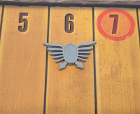
 It was a very simple process, actually. I started by doing a quick google image search for the Scythe board, looking for a high resolution image of the victory track (since I know that it has a clear and moderately large image of the power icon). I eventually found a good photo in an Ars Technica Review, which is cropped here.
Next, I opened up Inkscape, which has been my favorite art program for years (although Blender might be surpassing it...) and imported that image. Then, I drew a Bezier curve over half of it (my intent was to mirror it when I imported it into Blender, which gave me this result.
I wasn't super happy with the result and, part way through (before bothering to correct the finer details across the whole thing), I came up with a better idea. So, I threw that stuff onto another layer (in case I decided that I wanted it later for some reason) and started over. This time, I decided that I would make the central shield and each bar (wing?) as separate curves, which gave me a much better silhouette.
Don't worry about the overlaps - when I make them 3D in Blender, that issue will go away. Instead, what I liked more about this one was that the outline of the shield was perfectly smooth, rather than being my closest approximation to smooth like in the first attempt. Also, this would make it easier to make different heights on different parts in Blender.
 With my SVG built, I went over to Blender and imported it. The scale on the imported object was tiny, so I scaled it up a bunch until the wings were about 20 mm wide (I figured that was a good balance point where it would still fit on the board but give me room for details). After using ctrl-a to apply this new scale, I hit ctrl-j to join them all together into a single object and fixed the object origin by my favorite two-handed Blender shortcut: ctrl-alt-shift-c, then selecting Origin to Geometry.
That gave me something that looked really good in Object mode, so my next step was to mirror it. Because the object origin is in the middle of the object though, I wasn't quite ready to use the mirror modifier; I had to get my geometry to the far left of the object. So, I went into Edit mode and saw that I had an unusably complex set of Bezier Curves!
 That's ok though, since I didn't really need them to be Bezier curves any more. So, I popped back over to Object mode, selected it, pressed Alt-C and selected Convert to Mesh. That gave me something that I could work with.
The first thing that I had to do was to fix the right-most line, which would correspond with the middle of the shield after the mirror. See how it's not perfectly in line with the Y axis? Well, the solution there was easy. Just press b to box select all of those points, then press s and x to scale them along the X axis, and press 0. That straightened them all out. Next, I pressed a to select everything and grabbed the control handle to move it all left until the object origin looked like it was on my new center line.
 Those of you who use Blender are probably quaking in fear at this point - mirroring an object based on it "looking like" it's on the center line? That's a recipe for disaster, as vertices will have slight gaps and so fail to merge properly. That's why I selected that line of vertices again, opened up the data panel (press n), and changed the Local Median X value from my eyeballed 0.03086 to be truly 0. Problem solved. While I was in Edit mode, I selected everything and pressed f to make faces inside of all of those lines. Next it was time to mirror and solidify.
 I figured that 2 mm would be a good thickness, so that's what I used for Solidify, and then I added a Mirror modifier for the X axis. That gave me my basic shape, which I would have used, except that my printer was busy with another project that I'll hopefully be able to publish in a few days! So, I decided to add some embellishments to the model that I'd built, while I waited for the printer to become available.
The first thing that I did was to add some depth to the shield. I just grabbed the center line (with proportional edit enabled) and scooted it up on the Z axis a bit, to give the shield a bit of curvature. That completely messed up the bottom, so I undid it and changed things a bit. I selected the shield and pressed ctrl-p to make it its own object (and applied the mirror and solidify modifiers), then edited that object and hid all of the geometry except for the top surface of the shield.
 Now, with everything else hidden, when I moved the center line upwards, it wouldn't mess up the bottom. After doing that, I figured that it would be fun to add a border around the whole shield, so I selected those top faces, pressed e to extrude them, then pressed esc to not move them anywhere. With my newly extruded faces still selected, I pressed s and scaled them down, effectively creating an offset. With that offset created, I pressed e again, then extruded them -.2 mm. That created the shield! After reducing the height of the other things to 1.8 mm, I then used similar tricks to make the points of the arrows a little more 3D as well. And that's how I came up with the final model. Now, it sounds like my print has finished, so I've got some painting to do!
By the way, you can download this STL from Thingiverse here.
I've published the blend file for this for my patrons here.


Comments
Post a Comment